Writing for WhatCulture was a mistake. Apart from having my work chopped up into slide-based listacles, there is no longer any attribution on my pieces there. Trying to recover the now-dead images for the post yielded the thumbnails you see here.
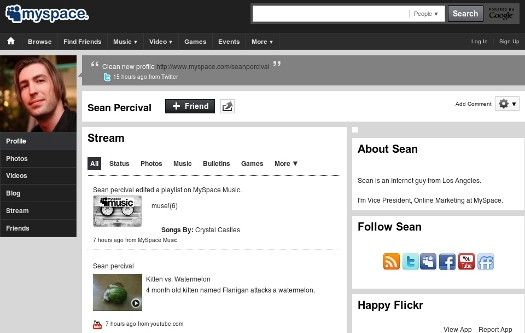
For the last several years, Myspace has fallen into a state of ridicule and abandonment. The once leader of social media platforms quickly fell to the feet of current giant, Facebook. Unable to innovate and keep up with Zuckerberg's website, Myspace attempted to change its direction, rebranding itself with a new logo and media focus. The result was a messy, unappealing, and unusable disaster.
Falling further into irrelevancy, Myspace finally sold for $35 million in 2011 to Specific Media, which is owned by the three Vanderhook brothers. These entrepreneurs split the stake with Justin Timberlake and planned to "evolve Myspace into the premiere digital destination for original shows, video content and music."
Ditching the stylizations MySpace and My____ for the more mature, Myspace, the Nickelback of social networks is finalizing its changes to the service and has opened the "new Myspace" to beta users by invitation. I quickly accepted my own and dove into the service's new features.
9. The User Interface (UI)

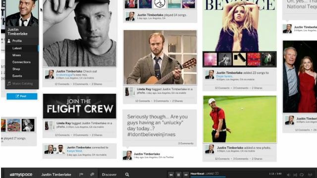
...is clean. The new Myspace works like a sideways Pinterest. You can now find the content posted by your friends and favorite artists in your "stream." At first look, it looks cluttered, but using the filters, you can pretty easily navigate content relevant to your interests (profile updates, photos, music, posts, etc.) The way you connect to content is new, too. You now have the ability to comment, connect, or share any post as long as its privacy level is set to public.
The connect feature is actually one of the biggest and focal additions to the site. You'll find it everywhere in the UI, pictures, music, mixes (I'll get to that) and most importantly, profiles.
It works like this, once a friend has joined the site, you can search for his name using the easily accessible and large fonted search function. Once on their profile, you can "connect" to them using a button that looks like a Venn Diagram. Once you've clicked it, the circle on the left will shade itself in. Once your friend connects from their end, the circle will meld into one shaded circle, representing completed connectivity. On photos, connecting seems to be the equivalent to the "like" feature on Facebook. Connecting to mixes will add them to your mixes menu.
Ah yes… click next to read about Mixes…
8. Mixes

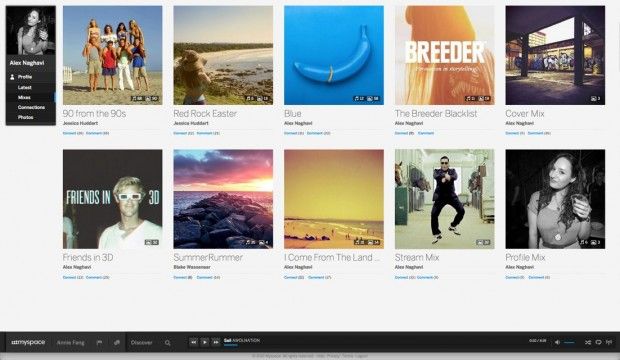
Mixes are one of the core offerings of the new Myspace. The are essentially photo albums, but with a twist. You can add more than photos. In your mixes, you can add music, videos, and photos all into one collection. Myspace's new informational source, AskMyspace says, "It's hard to say what exactly they are because, with some creativity, they can be anything."
As you begin to fill out your profile, several default mixes will be made for you. These include your Profile Mix, Cover Mix, and Stream Mix. Each will contain profile pictures, cover photos, and connected songs, respectively.
Speaking of profiles...
7. Profiles

Profiles were made to visually please. The use of fluid design elements make looking at profiles fun, while still holding some of the classic Myspace elements in place. The cover photo will be the most noticeable when visiting a profile page. This image will be the background on which the menu and information pane will sit and slide over. In that pane you'll find a short bio (150 character limit), connection statistics (Jake is more popular than Jack), location, site or blog url, profile song (doesn't play automatically), and then finally the user's Top 8 [friends].
Sliding your fingers on the laptop trackpad to the left or downward will bring the profile owner's stream into view, again in a sideways Pinterest style display. Before the user's content and activity is shown, there is a place to write on their stream, much like on a Facebook wall. You can also post media, like pictures or song recommendations right there for them to see when they log on. They'll, of course, see this via the notification icon on the...
6. Myspace Deck
[image missing]
This is where the media minded will want to pay attention. The Myspace Deck is the one constant on the entire site. No matter what page you are on, the Deck will be there with you.
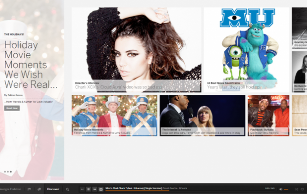
On the deck, you'll find (in this order) the Myspace home button, your name with a link to your personal profile, notifications, messages, discover, search, and then your media controls. These give you power over the media you experience throughout the site.
Hovering over the Deck will display a slide-up queue of whatever it is that you might be playing. This bar can be pinned open and has sub-menu's options such as Mixes, Messages, or Radio. Private listening sessions can by the toggle on the right side of this menu. This is also where you can drag and drop songs and pictures to quickly create mixes.
5. Radio
[image missing]
Terrestrial radio is dying, being replaced by satellite and internet alternatives. Pioneers like Pandora and Last.fm have set the standard and others have intelligently followed. Myspace is one in that number, introducing their own personalized radio stations. Starting from any song, artist, or genre a user can quickly start listening to related music. Now this is far from perfect. Myspace isn't using a musical genome to dictate what is related to what. It seems to instead draw from a genre and play histories of other users.
For testing purposes, I started with Frank Ocean's radio channel, first listening to the instrumental track "White." This moved to Mario, which was followed by a T-Pain ballad, which was followed by Monica, Drake, and Fantasia.
Not bad. Next, I tried starting a radio session with a song, specifically Anberlin's "Self-Starter." The results for this example were not as well matched as the previous. As related tunes, Myspace chose to play VersaEmerge, Cady Groves, and The Ready Set. Not exactly what I would expect from an alternative rock station.
There are obviously bugs and adjustments to be made to the radio feature. There is also no rating system (thumbs up or down) to indicate that a match isn't suited for a channel. These issues aside, positives can be found by the optimistic eye. For example, there are no limits to the number of skips that you make. The channels you make are also automatically saved and easily accessed by clicking the radio button.
4. The Catalog
[image missing]
There are tons of songs on Myspace; some old, new, and perhaps a few you haven't heard. That said, don't expect a Spotify or Rdio sized catalog just yet. There are some major holes in several of the discographies I looked at. For example, in Fun.'s profile, I can see the band's debut EP Aim & Ignite as well as the deluxe edition bonus tracks. The 2011 Christmas single is there as well. What isn't there, however, is the band's breakout full length Some Nights. All that can be found from one of this year's top records were the singles "Some Nights" and "We Are Young."
I reached out to Myspace to find out exactly where the music we're listening to was coming from and were told the following. "We have millions of songs available at your fingertips. Aide from lettings artists upload their own music, we also have agreements with record labels which allow us to have an immense catalog including the latest music."
As the catalog grows, so does my desire to scrobble all of my listens. When asked about Last.fm integration, a representative from AskMyspace said "We love, love. love the Last.fm. You are not alone in that idea. We will keep you updated....."
3. Media Quality
[image missing]
Listening with decent headphones will tell you that the audio quality on new Myspace is subpar. The crispy crackle of mp3 compression is noticeably apparent and the video quality is 480p at best. Oddly enough, there is no option for high definition switching either.
2. Account Types
[image missing]
There are 12 account types that can be selected when starting your account and in your account settings later. They are Musician, Photographer, Filmmaker, Curator, Designer/Creative, Entertainer, DJ/Producer, Brand, Venue, Writer/Journalist, Promoter, Fan, Comedian. For now the only changes that will be made to your account by choosing any of these types is the ability to upload songs. These options are available to musicians, DJs, promoters, venues, and comedians. More options will be available as updates roll out.
1. Issues
[image missing]
While the general aesthetic is great, there are still a lot of bugs to work out. After using new Myspace daily for a week, I've made a list of things that need adjustments.
Things that will likely get fixed or added in time, or before the beta is up include chats not saving after refresh, links in chat being clickable, and notifications not being instantaneous. There are also some bugs when switching from song to song that will display the metadata for the newly selected song, but will play the previous selection.
Some ideological issues are also present. For example, the way cover images are handled upon upload isn't perfect and could be made easier to prevent time spent reworking an image in an external editor. Making the images scalable or seeing a preview would be helpful. The platform also lacks a way to separate friends from musicians, making it difficult to locate the personal updates from the more newsworthy. Click "next" below for our final verdict on the New Myspace!
Verdict
[image missing]
While new Myspace has been fun to play with and looks great, I've failed to find a purpose for daily use. Facebook has the people I connect to, Twitter has the minute to minute updates I crave, Instagram has the photos I share, and Spotify/Rdio have the music I listen to. While Myspace has the potential for being great once again, I don't expect it to regain and keep a hold of the volume of users Facebook boasts or even what they had in their glory days. Instead, it looks like the continued focus will be music and media. The question that remains is the capacity at which the new service can be used by musicians to reach their fans.
New features are promised by launch, fixes and adjustments too. So we may yet see what will save the floundering company. So far, I'm enjoying my beta access and adjusting out Top 8s as my friends join in. Did I mention Tom was back?