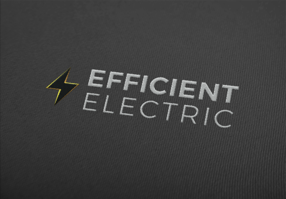
A midwest-based electrician hired me to create a logomark for their new company back in 2017. The business doesn't have a web presence that I've been able to find, so I haven't seen my work in use, but I enjoyed creating a logo that would look smart on paper, repair vehicles, and embroidered on uniforms.
The Process
When the client approached me, I figured a lightening bolt was a good place to start. How to differentiate it and keep it professional was the challenge.
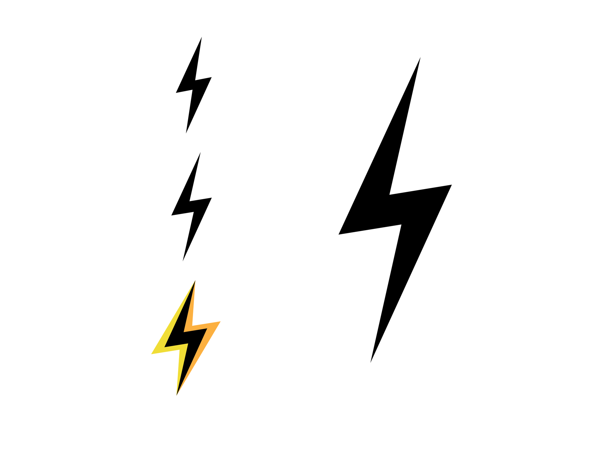
What I started with wasn’t actually much different from the final result, just thinner. I knew I wanted the opportunity for a few tones that would make the logo pop in color and show some depth in grayscale.
This was never shown to the client. Too zany.
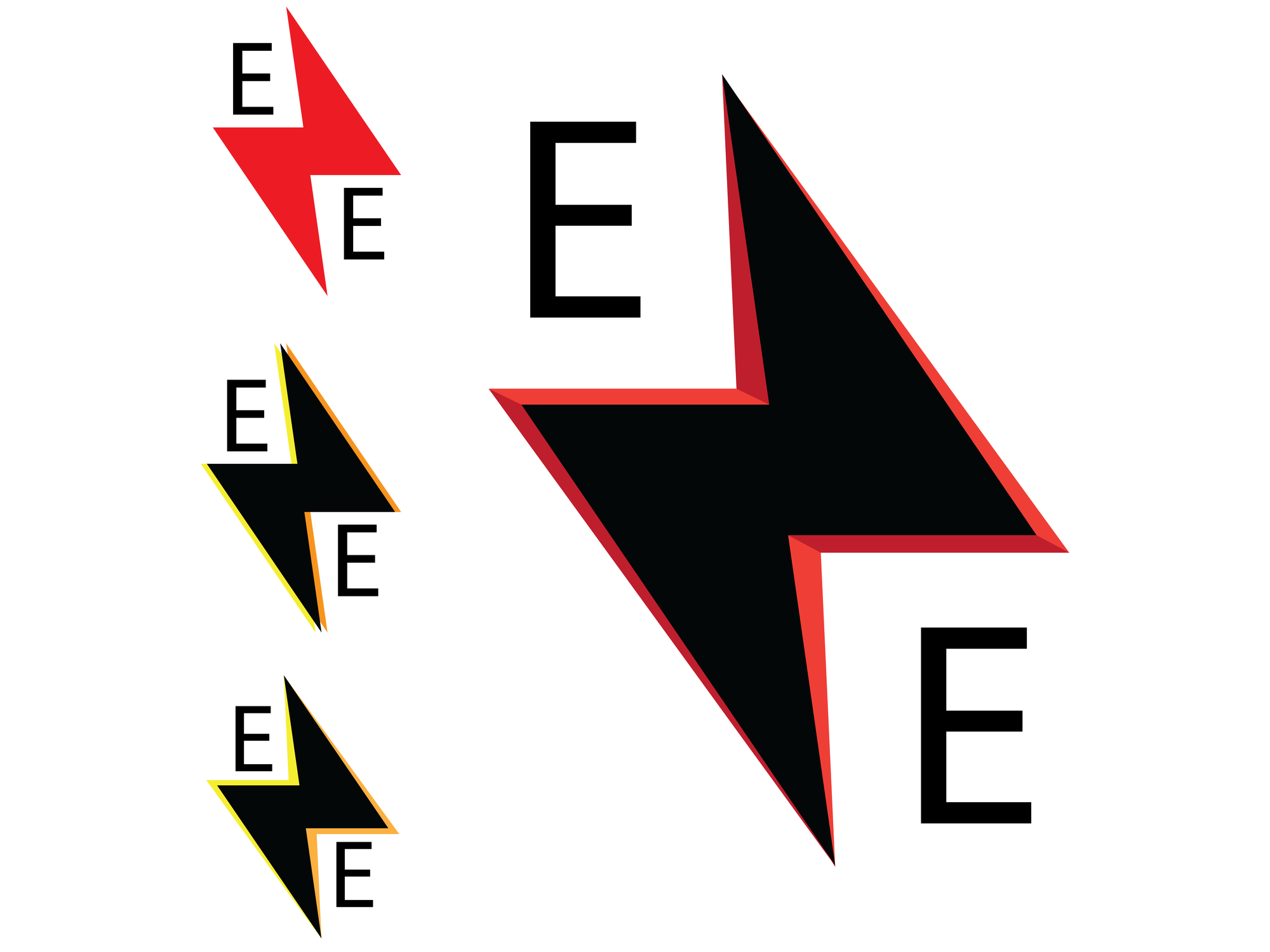
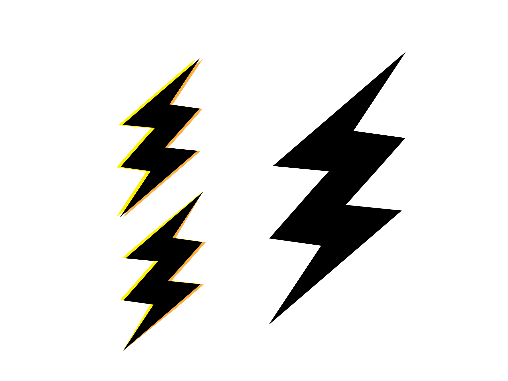
Here’s where the shape came into place. Strong and sturdy, just facing the wrong way. I liked the initial direction, but the Efficient Electric acronym just didn’t look right. The balance was off, so we sat on this for a few days to see how it felt.
We decided to nix the idea and flip it back around, opting for a few options using the company’s full name.
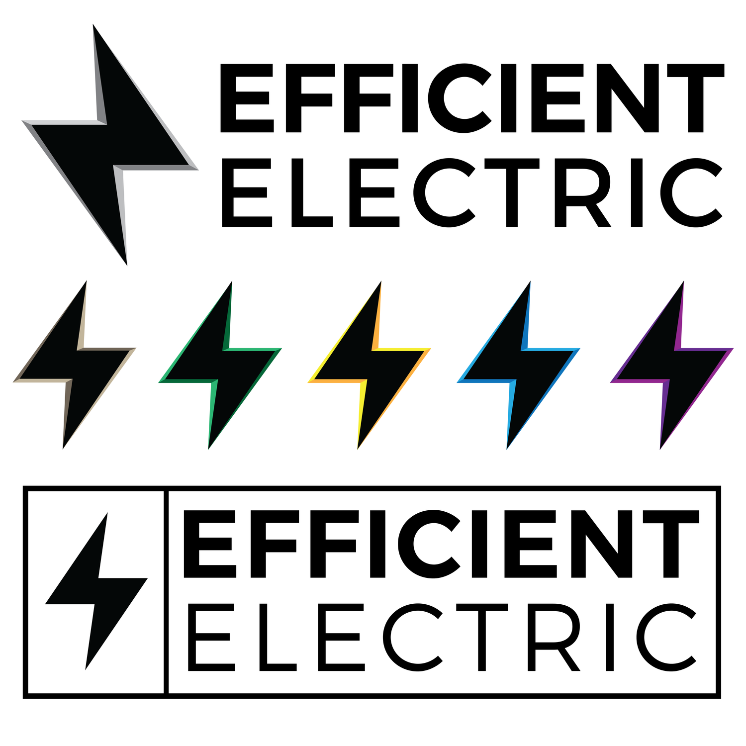
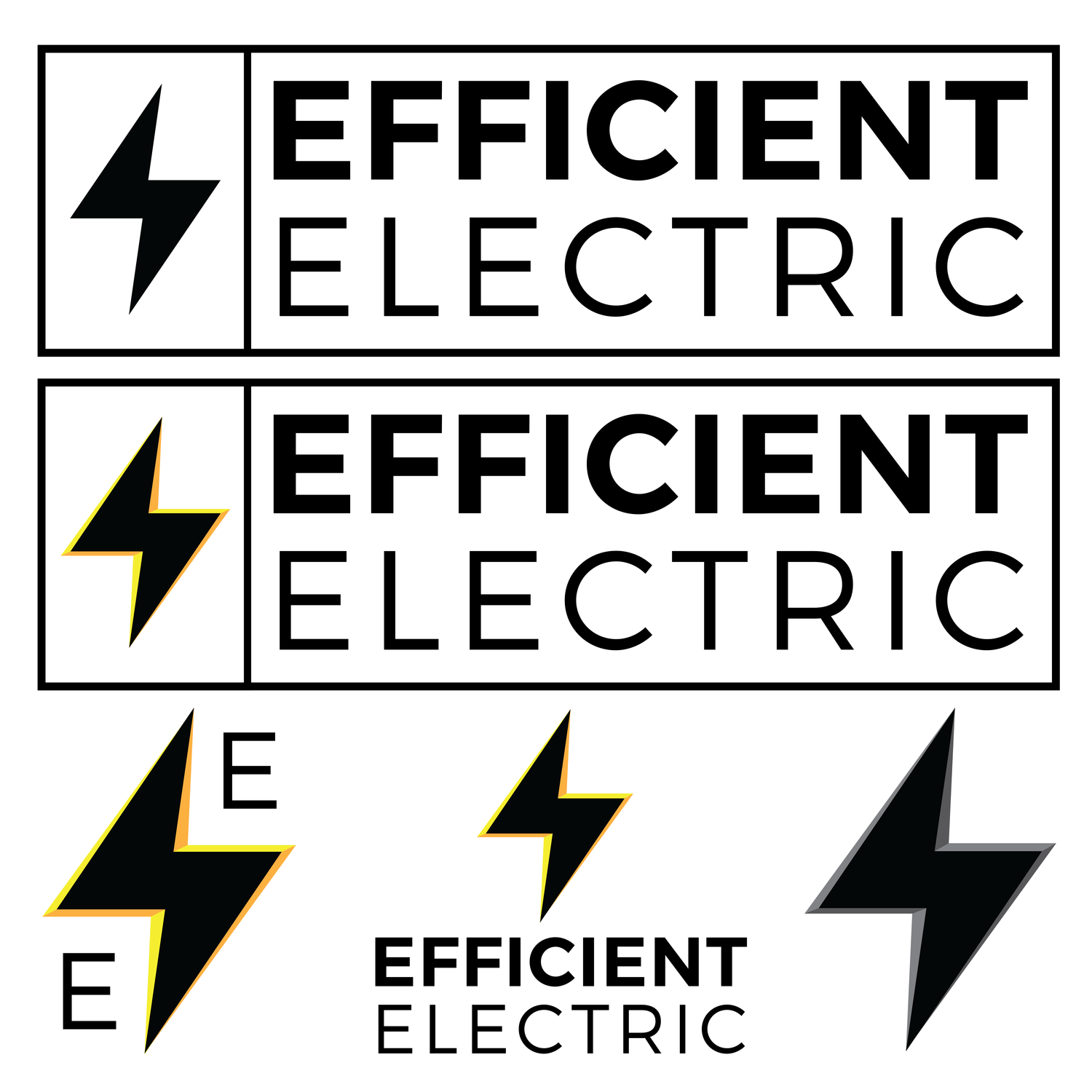
Many of my local clients are interested primarily in simple logos that will look great in grayscale. Color isn’t normally a factor. I like to give them some options though, knowing that there will be opportunities beyond letterhead that they have yet to consider.
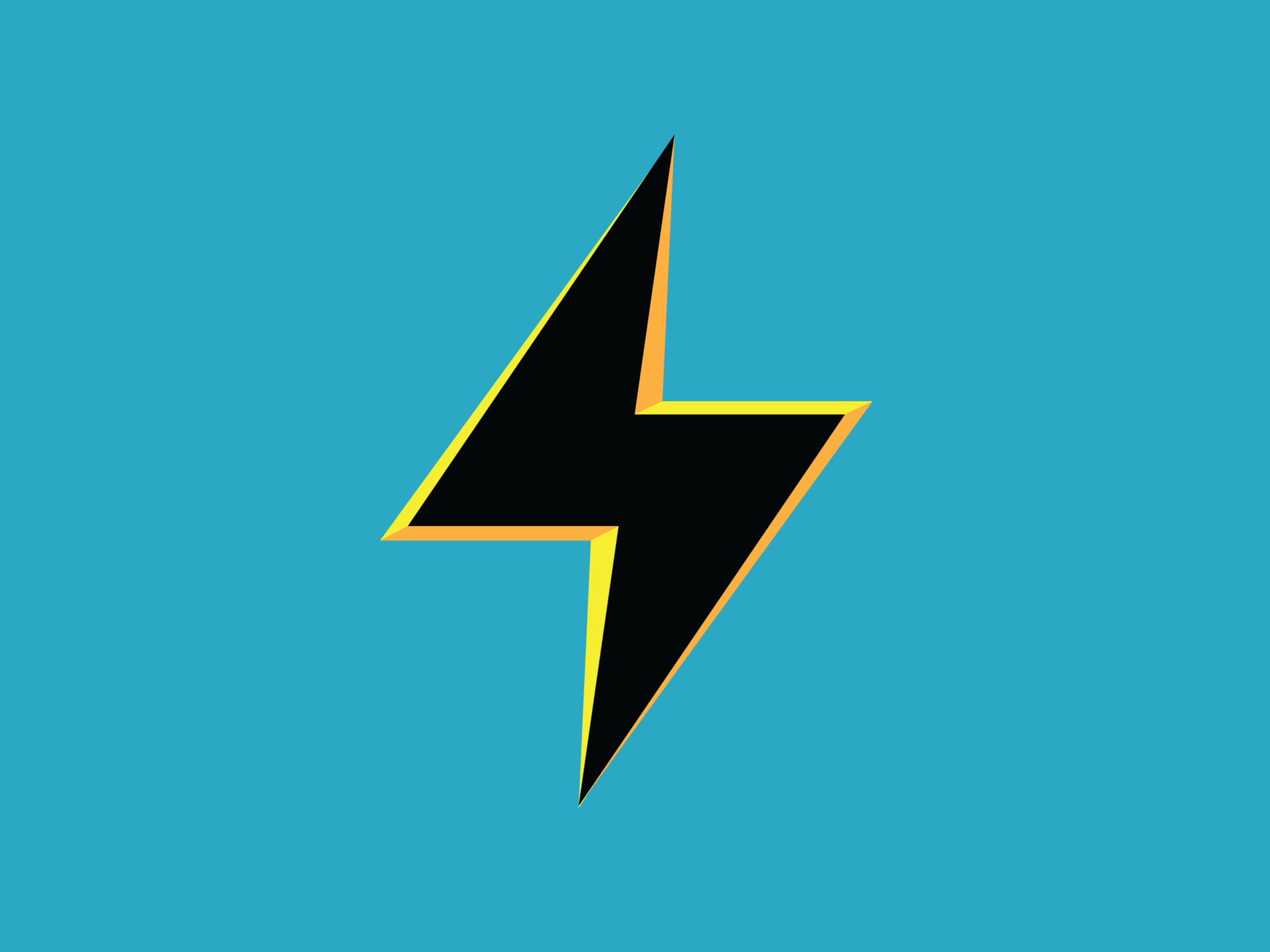
After asking about the client’s marketing plans, I chose a few colors that might appeal. Yellow was the favorite.
A final one sheet of the approved designs.