I started my first Tumblr account in 2008. I used it infrequently and eventually moved fully to my Wordpress blogs in late 2009. I used self-hosted Wordpress blogs for 5 years before returning to Tumblr to begin this blog. It fits my writing needs perfectly.
I’ve noticed the changes to Tumblr over the years, but only now do those changes affect the workflows and productivity I’ve made for myself since I opened curbside.audio last year. Last week, Tumblr announced a great many changes that I’ve just begun to see on my dashboard. Let’s take a look and deconstruct.
Text Titles:

Here is a look at the dashboard view of a PropertyOfZack article. Look at that title. I’ve counted an average of five words per line in the titles throughout my dashboard this evening. Five.
Why the font size was increased, I’m not sure. If it’s part of the platform’s push for long-form readability, this is a major flop. I think the former font size was just fine. A dynamically scaled font size would be perfect. The longer the title, the smaller the font. This is a distracting change I’m decidedly not fond of.
Links:

I see what Tumblr was going for here. Taking a number of text-form slots and condensing them into an attractive, editable, box. It looks just like the preview available on the dashboard, but it’s not very functional. It cuts off a majority of the title and is really hard to edit. Unreasonably hard. For example, once a title is parsed from a URL, you can’t click and drag a selection to delete.

Instead, you have to switch to your keyboard and tap your arrow keys to either make a selection or navigate to the end of the title for backspacing. Either way, you’re using a lot more keystrokes.
Markdown:

The support for Markdown on Tumblr has vastly improved in the lastest update. Markdown is automatically formatted so you know you’re doing it right.[1] This is extremely helpful to those of us who choose to write this way.
The Editing Window:

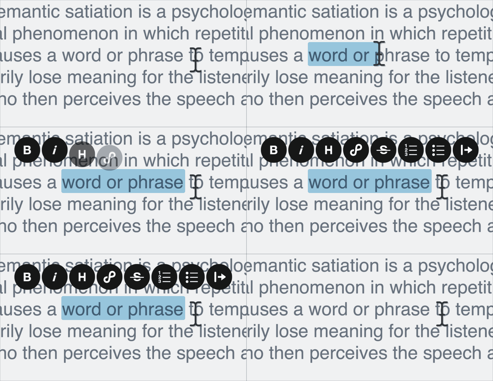
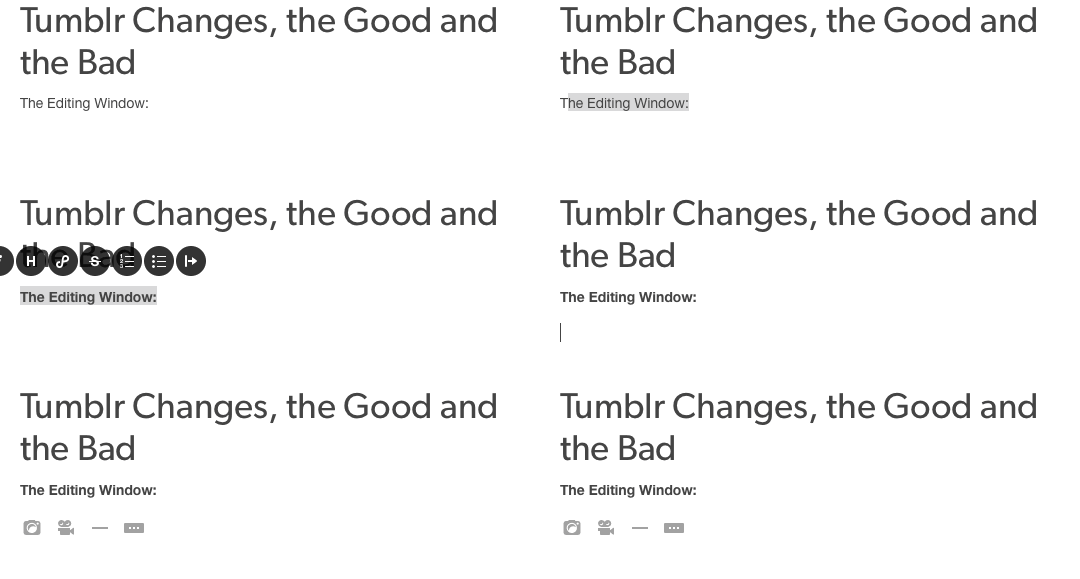
Aside from the improvements to Markdown, Tumblr has added a bunch of Medium-like changes to the UI. Trick is, you’ve got to use the rich text editor to access them. This is what Tumblr calls “normal.”[2]
What you get with this kit is a pop-pop menu with things to change your text. If you want to bolden, italicize, or indent your text with UI. This is how you do it. The real utility of this is that your menu is wherever you are within your article. You don’t need to scroll anywhere to find it.

Between lines of text, you can insert media, horizontal rules, or a read more break. This is useful for popping in images or videos after you’ve finished writing. This is not useful for HTML or Markdown users who then have to upload photos elsewhere, copy the image link, then paste it into nescessary display code.
Pasting Rich Text:

Finally, there is this. Pasting copied rich text results in plain text. All links and styles are stripped. This seems like a misstep because I don’t see how that is useful at all.
Conclusion:
Tumblr has obviously put a lot of thought into this set of changes, but they have made some major mistakes for those who use the platform for more than GIF sharing and wanderlusting as a majority of their users do. For a company trying to push further into long-form blogging, they’ve certainly not made it easier for those who write long-form entries. “Normal” users will really enjoy the addition of the selected text bar and easy multimedia input assistant while Markdown and HTML users continue to upload images remotely. [3]
If Tumblr truly wants to attract more long-form writers to their ecosystem, they need to look further at what companies like Wordpress, Medium, and Movable Type are doing to facilitate their users’ needs, not just how they design their UI
Mostly. Bold works, bullets work, links work, but italics just go grey. ↩
This is really poor language when talking about user preference. The implication here is that anyone using Markdown or HTML is something other than normal. Atypical might be more accurate. Less usual, maybe. Not abnormal. I digress. ↩
Or using my workaround. ↩